E-com Nexus-Dashboard
E-com Nexus-Dashboard
E-com Nexus-Dashboard
Ignitabull-October ‘24

My role
UX Lead- Interaction Design, Wireframes,
Visual Design, User flow
TEAM
Jeremy Hamilton (Co-founder, Marketing Tech), Andy Williamson (COO), Dan Kim (Account Manager), Guilherme Ruy, Pedro Pedro Marques
(Data Analytics Team), Caryn Mackenzie, Sean Silvino
(Marketing Team)
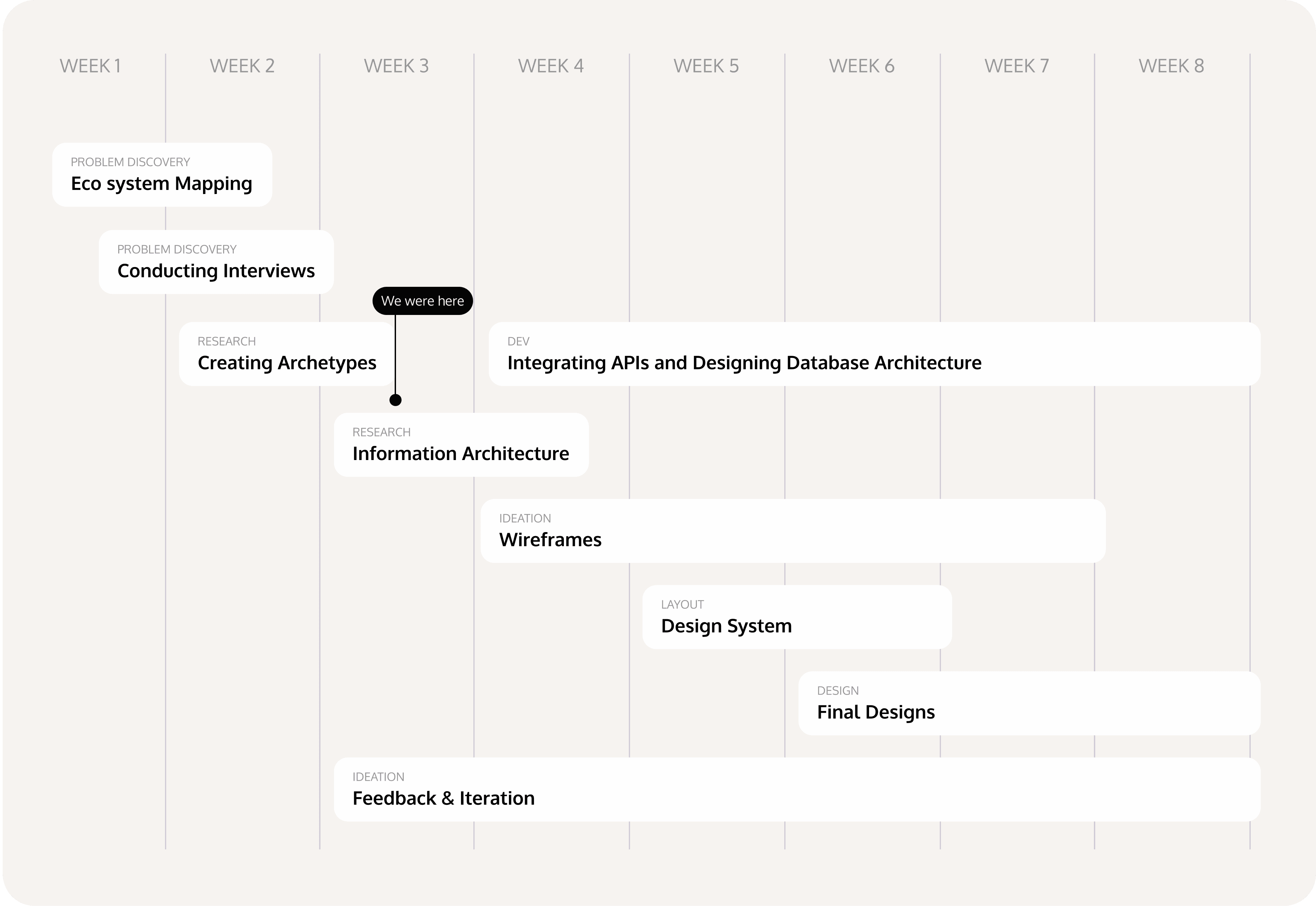
Timeline
2 Months
OVERVIEW
For a small-sized marketing company reporting was manual, time-consuming, and inconsistent across client accounts. As the UX Designer, I led the end-to-end design, working closely with data analysts, marketing professionals and account managers to bring clarity to the chaos.
The result was aimed as a customizable, intuitive dashboard that automated data aggregation, ensured consistent reporting, and allowed for quick, data-driven decisions saving 10-15 hours per quarterly report.
The concept was met with enthusiastic approval from the team; however, the project was ultimately shelved during development.
Highlights
A Dashboard with multi-channel client data in a clear, actionable way
A Dashboard with multi-channel client data in a clear, actionable way
A Dashboard with multi-channel client data in a clear, actionable way
Context
Bridging the Data Communication Gap
Presenting multi-channel client data in a clear, actionable way became imperative
A clear, consistent, and actionable report had become essential, as clients were losing track of inventory and experiencing communication gaps. Clients were increasingly expecting a visible, proactive plan of action


Problem Discovery
There was more to the problem
Unveiling Pain Points through Research
To understand the challenge fully, I conducted interviews with key stakeholders, including account managers, data analysts, and clients. The findings revealed some core issues.
Problem Discovery
There was more to the problem
Unveiling Pain Points through Research
To understand the challenge fully, I conducted interviews with key stakeholders, including account managers, data analysts, and clients. The findings revealed some core issues.
Problem Discovery
There was more to the problem
Unveiling Pain Points through Research
To understand the challenge fully, I conducted interviews with key stakeholders, including account managers, data analysts, and clients. The findings revealed some core issues.
Problem Discovery
There was more to the problem
Unveiling Pain Points through Research
To understand the challenge fully, I conducted interviews with key stakeholders, including account managers, data analysts, and clients. The findings revealed some core issues.
Problem Discovery
There was more to the problem
Unveiling Pain Points through Research
To understand the challenge fully, I conducted interviews with key stakeholders, including account managers, data analysts, and clients. The findings revealed some core issues.

Discovering Shared Challenges with Archetypes
I created Archetypes to address the specific needs of both our internal team—marketing leads, CMOs, and account managers as well as client-side stakeholders. They capture shared challenges in data interpretation, insight prioritization, and strategic planning.
The Data Communicator
• Lack of Easily Interpretable Insights
• Weak Actionable Communication
The Strategic Planner
• Inconsistent Data Presentation
• Lacks Integrated Sales Overview
The Data-Driven Decision Maker
• Overwhelmed by numerous metrics
• Challenges in conveying product issues and driving client buy-in for changes.
Research Summary
Building the Blueprint
Steps Toward a Unified Vision
To understand the challenge fully, I conducted interviews with key stakeholders, including account managers, data analysts, and clients. The findings revealed some core issues.
Research Summary
Building the Blueprint
Steps Toward a Unified Vision
To understand the challenge fully, I conducted interviews with key stakeholders, including account managers, data analysts, and clients. The findings revealed some core issues.
Research Summary
Building the Blueprint
Steps Toward a Unified Vision
To understand the challenge fully, I conducted interviews with key stakeholders, including account managers, data analysts, and clients. The findings revealed some core issues.
Research Summary
Building the Blueprint
Steps Toward a Unified Vision
To understand the challenge fully, I conducted interviews with key stakeholders, including account managers, data analysts, and clients. The findings revealed some core issues.
Research Summary
Building the Blueprint
Steps Toward a Unified Vision
To understand the challenge fully, I conducted interviews with key stakeholders, including account managers, data analysts, and clients. The findings revealed some core issues.
Adaptable
Design the dashboard with editable sections, such as the summary and next steps, allowing users to update content based on evolving client needs.
Actionable Insights at a Glance
Prioritize key metrics and trends, using visual highlights to make critical insights clear and immediately actionable for stakeholders.
Enhanced Usability and Interactivity
Design with intuitive navigation and interactive elements, empowering users to filter, drill down, and customize views based on specific objectives or client needs.
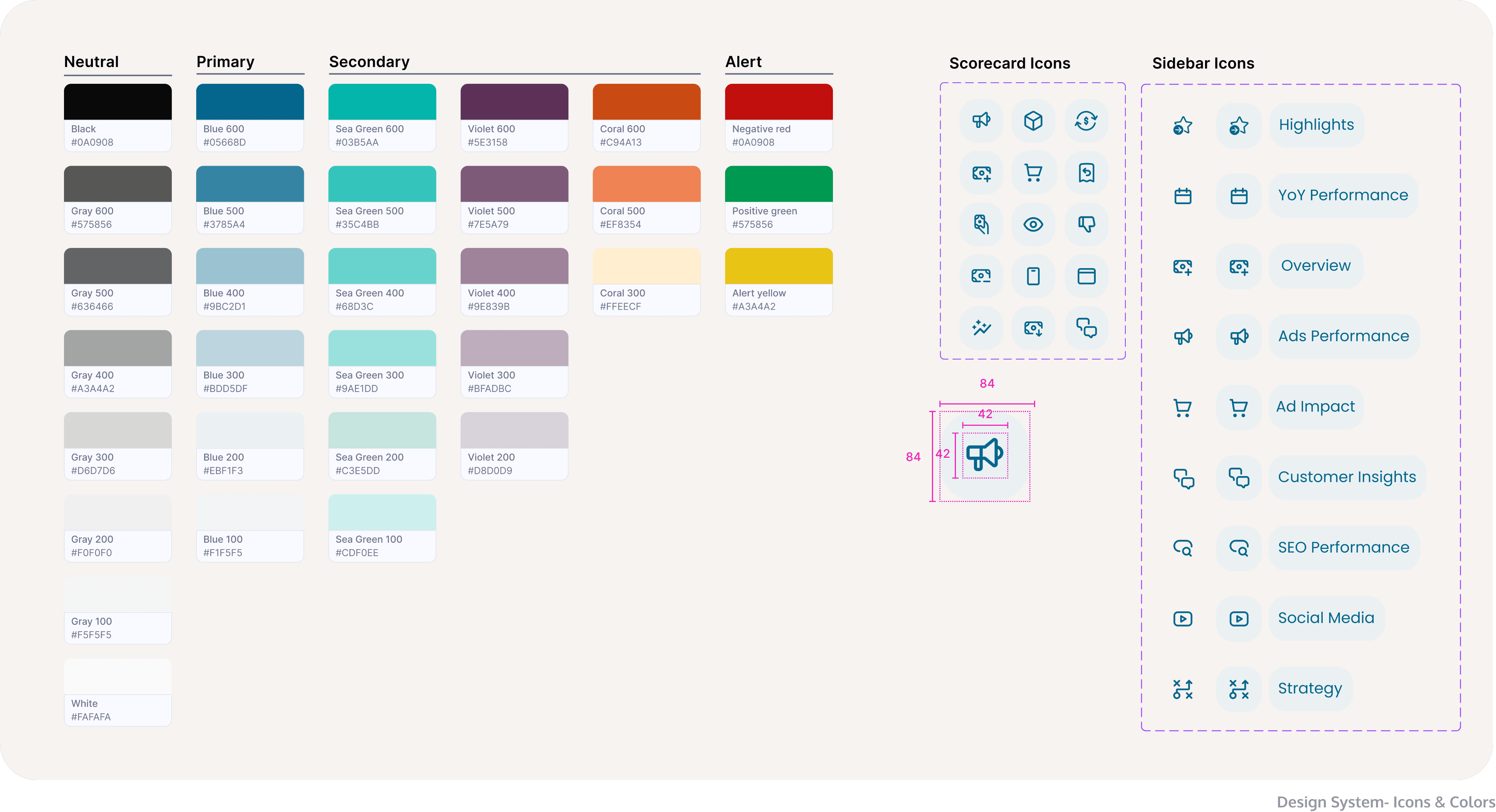
Design system
A Fusion of Old & New
Some Old some New
Instead of reinventing the wheel the existing components like buttons & text fields from Ignitabull’s design system were used (p.s. also created by me) along with adding necessary components (new icons, colors)
Design system
A Fusion of Old & New
Some Old some New
Instead of reinventing the wheel the existing components like buttons & text fields from Ignitabull’s design system were used (p.s. also created by me) along with adding necessary components (new icons, colors)
Design system
A Fusion of Old & New
Some Old some New
Instead of reinventing the wheel the existing components like buttons & text fields from Ignitabull’s design system were used (p.s. also created by me) along with adding necessary components (new icons, colors)
Design system
A Fusion of Old & New
Some Old some New
Instead of reinventing the wheel the existing components like buttons & text fields from Ignitabull’s design system were used (p.s. also created by me) along with adding necessary components (new icons, colors)
Design system
A Fusion of Old & New
Some Old some New
Instead of reinventing the wheel the existing components like buttons & text fields from Ignitabull’s design system were used (p.s. also created by me) along with adding necessary components (new icons, colors)


Design
What’s the best way to visualise the data?
Data Design Focused on User Needs
To begin with I prioritized key metrics based on user needs for the overview page. Main sales metrics were displayed as scorecards at the top, with the sales trend shown in a graph below. Ad performance was represented with scorecards and a pie chart next to that, ensuring key insights are easily accessible and clear.

Cards that communicate data
The card components contained critical data.They were meticulously designed to enhance readability, ensure clear metric interpretation, and for responsiveness across devices.
Cards that communicate data
The card components contained critical data.They were meticulously designed to enhance readability, ensure clear metric interpretation, and for responsiveness across devices.
Cards that communicate data
The card components contained critical data.They were meticulously designed to enhance readability, ensure clear metric interpretation, and for responsiveness across devices.
Cards that communicate data
The card components contained critical data.They were meticulously designed to enhance readability, ensure clear metric interpretation, and for responsiveness across devices.
Cards that communicate data
The card components contained critical data.They were meticulously designed to enhance readability, ensure clear metric interpretation, and for responsiveness across devices.

Complex Amazon Ads Data at a Glance?
Amazon Ads contains vast amounts of data, which can be overwhelming without clear prioritization and easy access to key metrics. Through discussions with Amazon account managers, I learned that their main need was to understand the performance of different ad types and campaigns, and assess whether they are converting over time to evaluate ROI and make improvements.
I designed an interactive sidebar where each option in the sidebar represents a main section of the report, allowing users to jump directly to their section of interest without scrolling.
I designed interactive charts and graphs that provide users with a clear overview of trends at a glance, while offering detailed insights through hover interactions when needed.
Retrospective
From a Vision to Design
Progress was looking awsome!
The Quarterly Report Design was presented with the entire Ignitabull team in mid-October 2024 and was well received. The team really wanted to start building it.
Retrospective
From a Vision to Design
Progress was looking awsome!
The Quarterly Report Design was presented with the entire Ignitabull team in mid-October 2024 and was well received. The team really wanted to start building it.
Retrospective
From a Vision to Design
Progress was looking awsome!
The Quarterly Report Design was presented with the entire Ignitabull team in mid-October 2024 and was well received. The team really wanted to start building it.
Retrospective
From a Vision to Design
Progress was looking awsome!
The Quarterly Report Design was presented with the entire Ignitabull team in mid-October 2024 and was well received. The team really wanted to start building it.
Retrospective
From a Vision to Design
Progress was looking awsome!
The Quarterly Report Design was presented with the entire Ignitabull team in mid-October 2024 and was well received. The team really wanted to start building it.

Not the ending we hoped for.
In November of 2024 the Ecom Nexus Project was paused by the company and team was disbanded.
Not the ending we hoped for.
In November of 2024 the Ecom Nexus Project was paused by the company and team was disbanded.
Not the ending we hoped for.
In November of 2024 the Ecom Nexus Project was paused by the company and team was disbanded.
Not the ending we hoped for.
In November of 2024 the Ecom Nexus Project was paused by the company and team was disbanded.
Not the ending we hoped for.
In November of 2024 the Ecom Nexus Project was paused by the company and team was disbanded.
I still learnt alot
Data Storytelling
Data Storytelling Data is subjective until there is enough context to it. Hence, the correct visualisation of data plays an important role in telling the story
The Importance of Adaptability
I learned to adapt quickly to shifting priorities and organizational changes, ensuring that the work I produced remained relevant and could be repurposed for future projects.
Collaboration is Key
I realized how critical cross-functional collaboration is, especially when dependencies arise. Strengthening alignment between teams early on can help mitigate delays.
VIEW MORE ProjectS
VIEW MORE ProjectS
VIEW MORE ProjectS
VIEW MORE ProjectS

AI Features for Group Travel Planning
Connecting personal social media inspirations to unified decisions and AI chat facilitation for conflict resolution
View Project
